With a renewed visual identity, Amco establishes itself with a more solid, contemporary communication style, aligned with the challenges of the future.
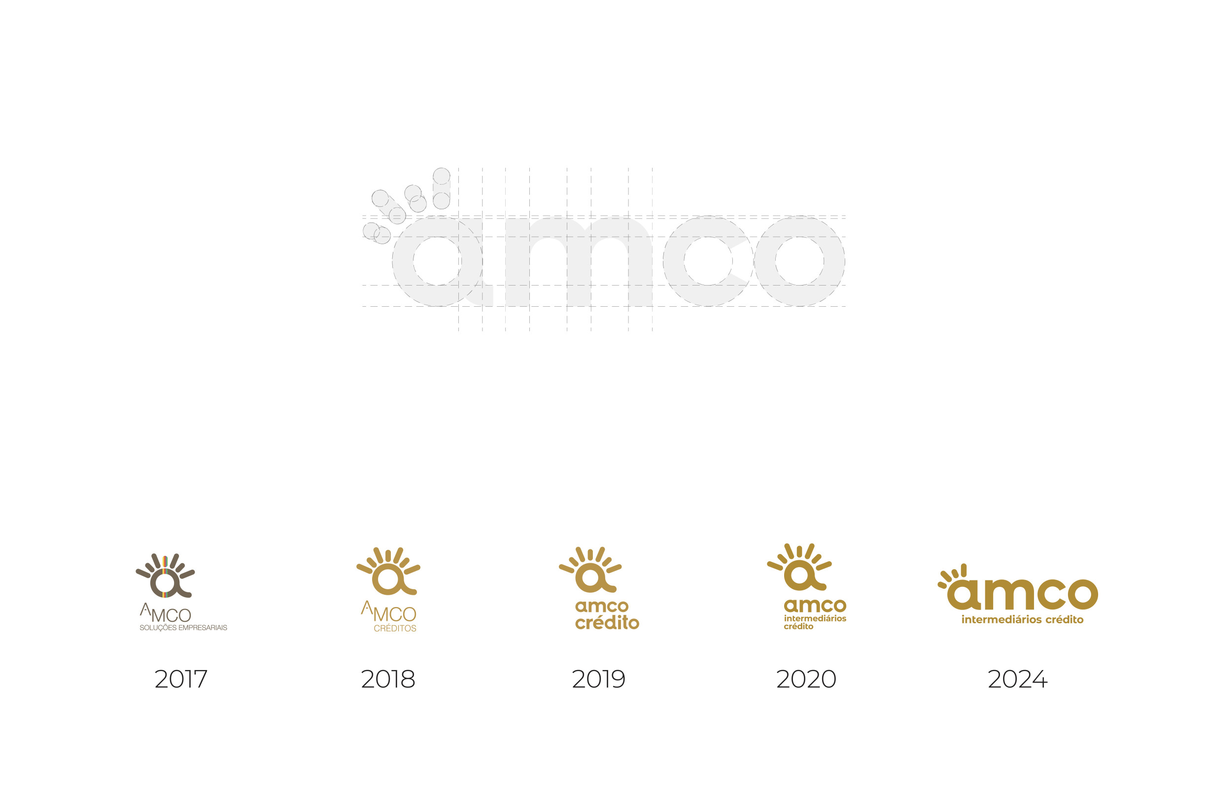
The rebranding emerges in response to a clear ambition: to evolve without losing its essence, to modernize while preserving its values. Inspired by the geometry that structures the brand, we redesigned the icon with a subtle yet strategic touch — a graphic reinterpretation that reflects balance, clarity, and consistency.
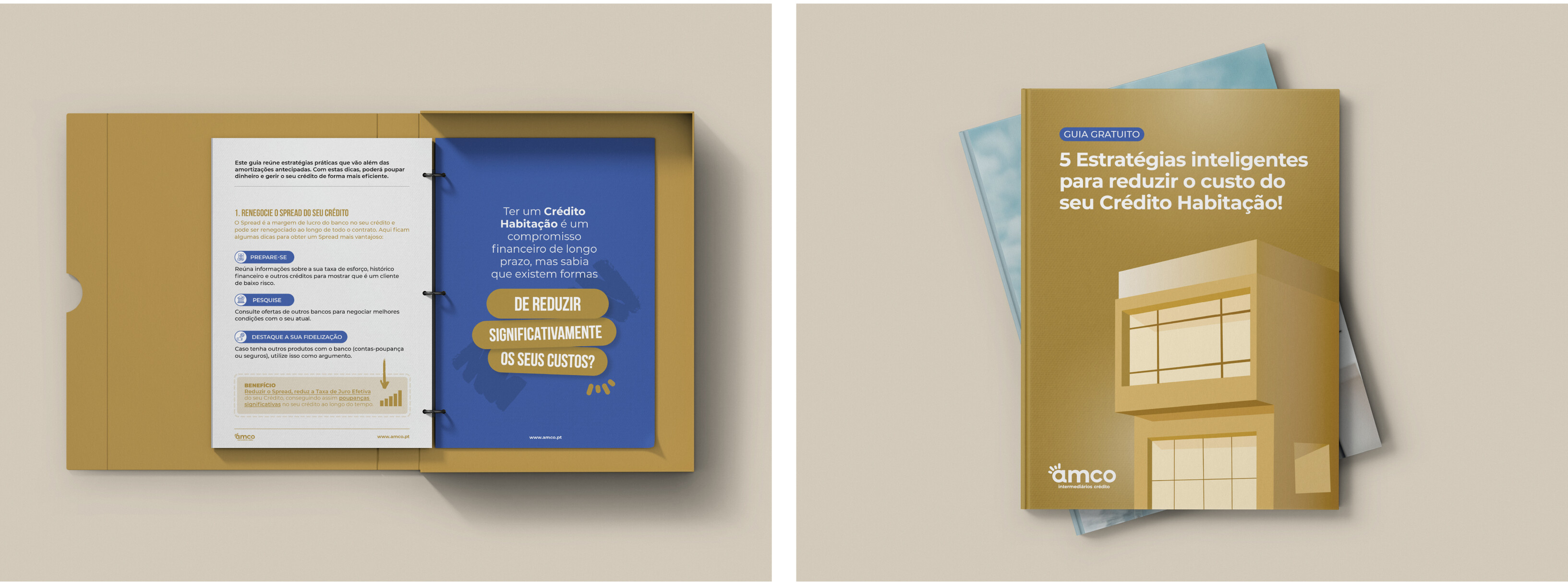
This foundation gave rise to a cohesive visual system, where every element communicates purpose. Gold, a symbol of value and stability, takes center stage, now complemented by a modern blue that propels the brand into the future — more current, more relevant, more Amco.
