Bárbara Timo
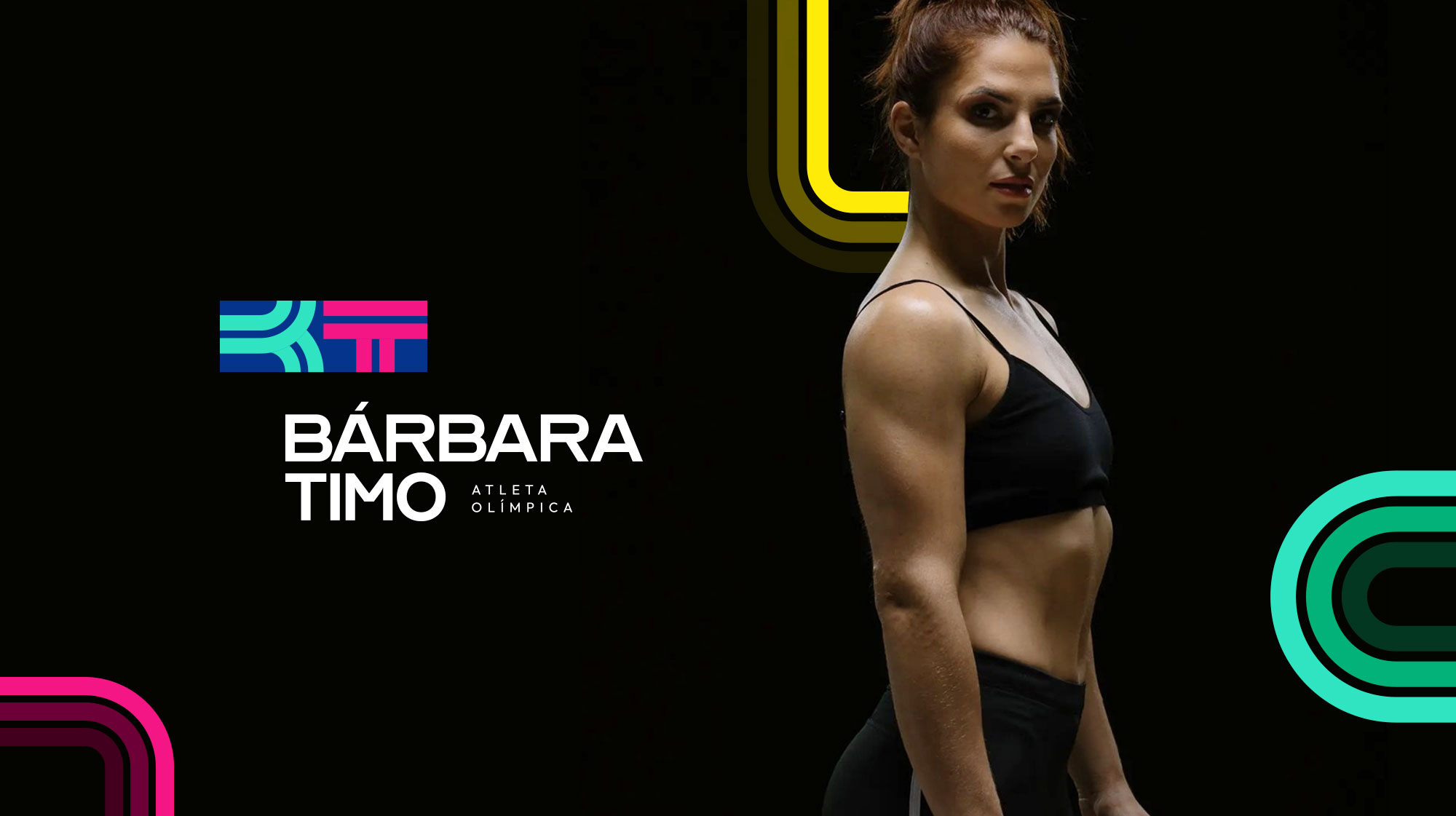
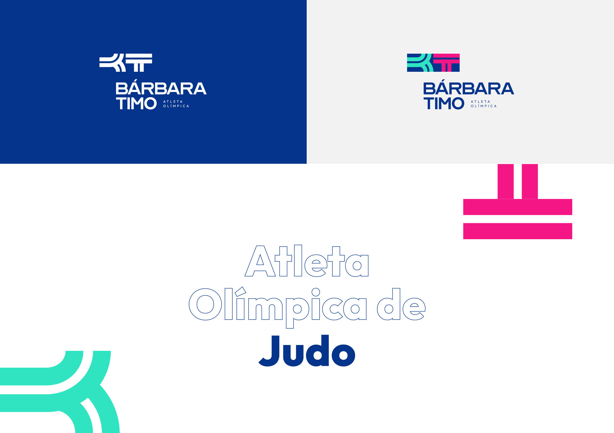
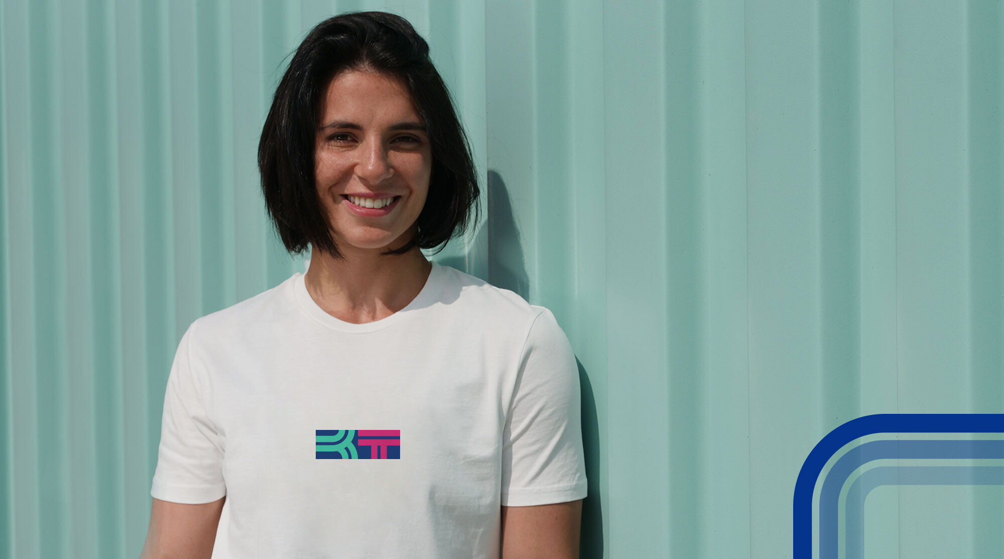
Dynamism, adaptability, and strength are the qualities reflected in the design. The judoka’s new image draws from the shapes of the letters B and T, as well as the fluid movements central to judo.
Serenity and spirituality inspired the selection of blue and green for the colour palette, while feminism led to the inclusion of pink.
The website – barbaratimo.com – establishes a strong digital presence for the athlete, allowing fans and followers to track her journey and achievements. Through this new venture, the judoka extends her brand internationally, sharing the values and principles that drive her career.


We realize ideas.
Contact us