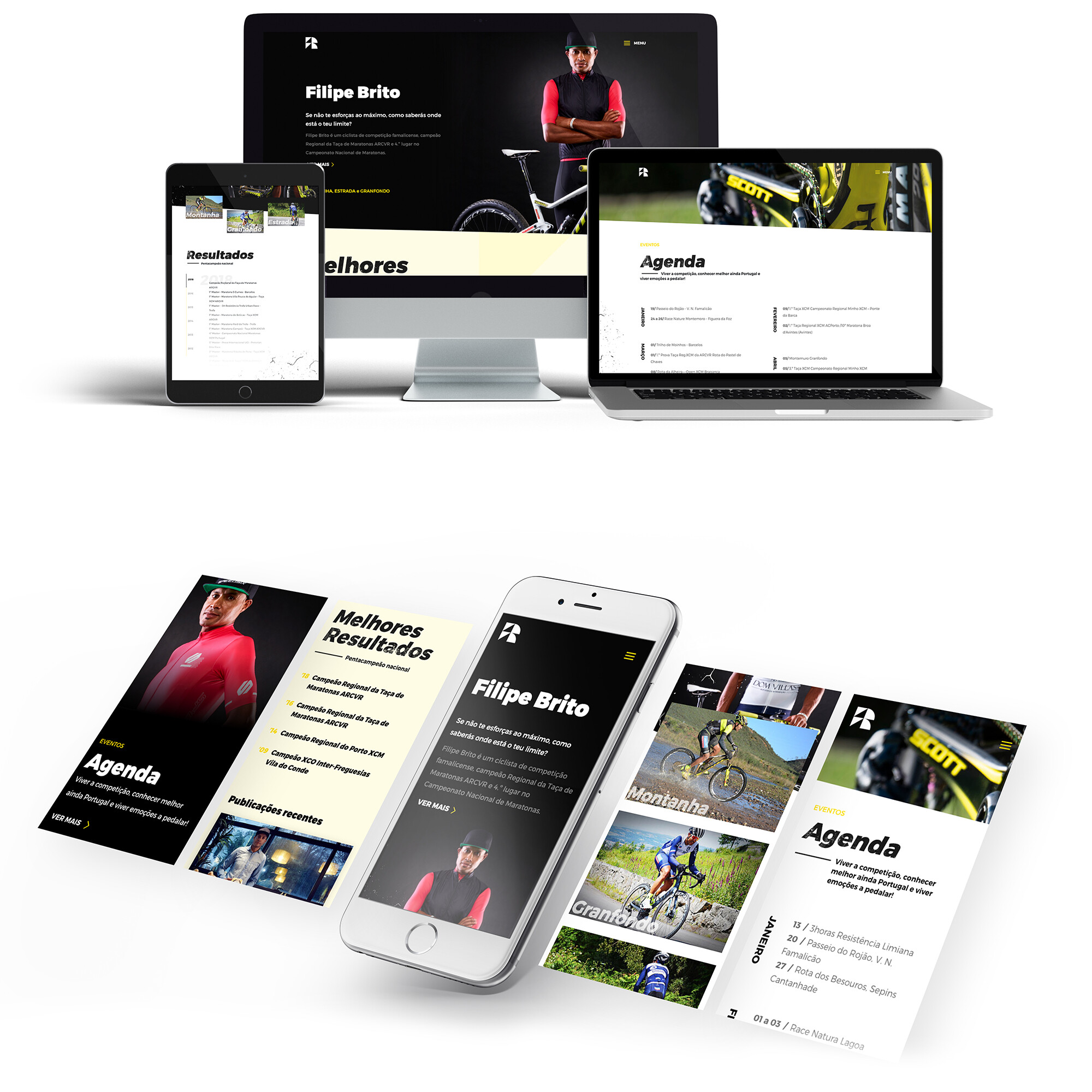
Have you ever imagined that a mountain biking professional could fly? The need of a new website led to the renewal of the visual identity of cycling champion Filipe Brito’s brand, who with our help gained wings and now reaches even higher flights.

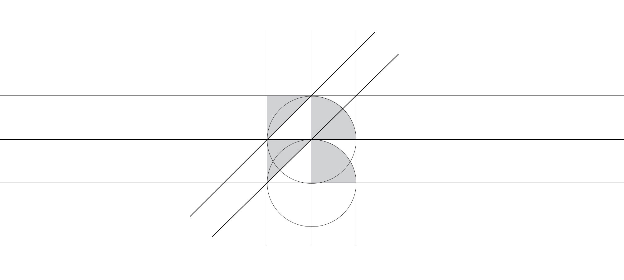
Champion Filipe Brito’s new image comes from three simple geometric forms: a circle, a square and a triangle.
Since ancient times, the circle has been associated with sport and constant movement – the wheels of a bicycle as it moves down the street. The square, due to its four equal sides, represents balance. When we cut out small details from each one, we obtain an equilateral triangle – representation of a mountain.
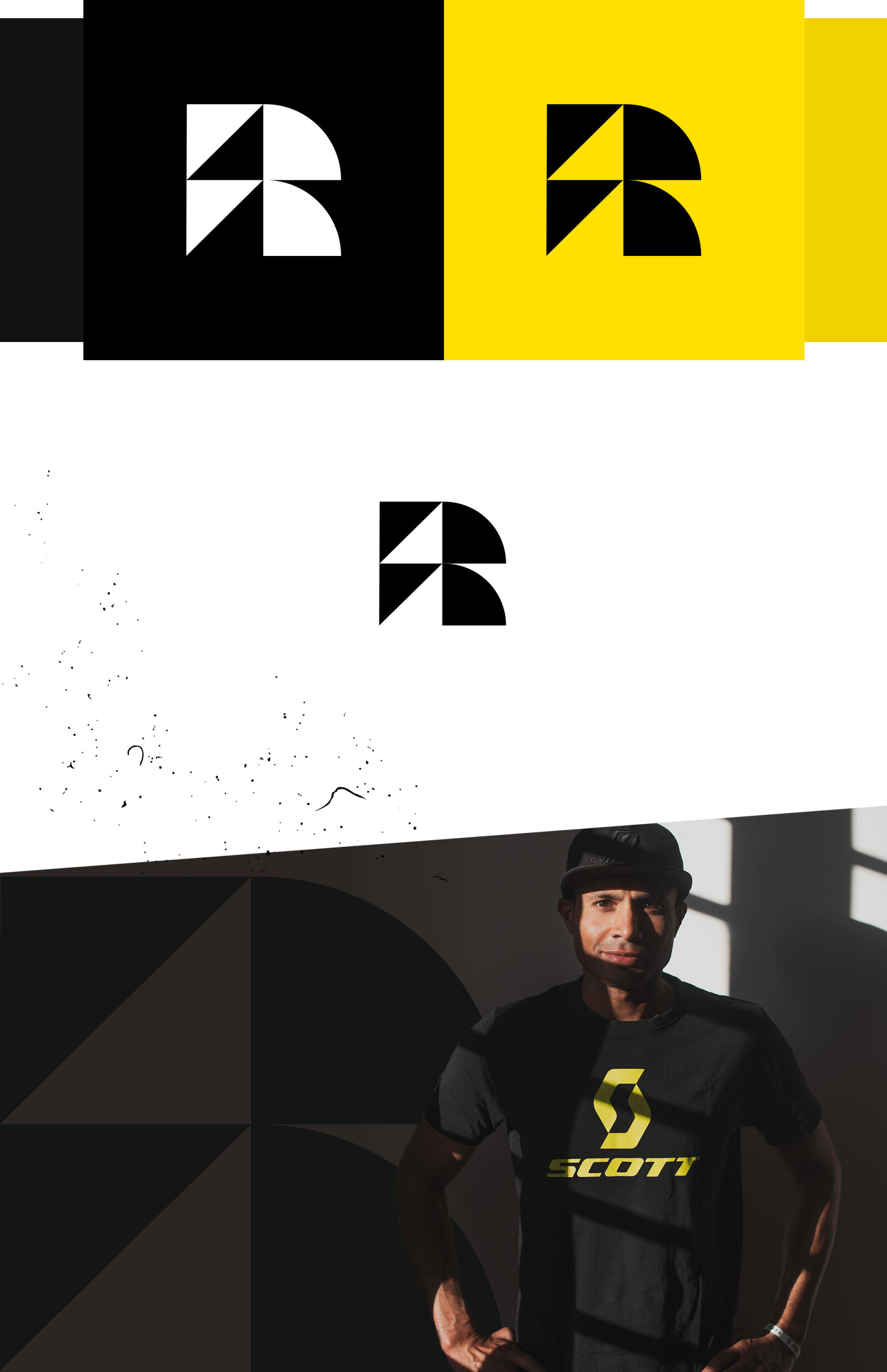
These two figures allowed the creation of a logo that stylizes the letters F and B – initials of the brand name.


