Sajo
The fusion of the founders' names inspired a conceptual approach that creates a personal and authentic connection with the brand.
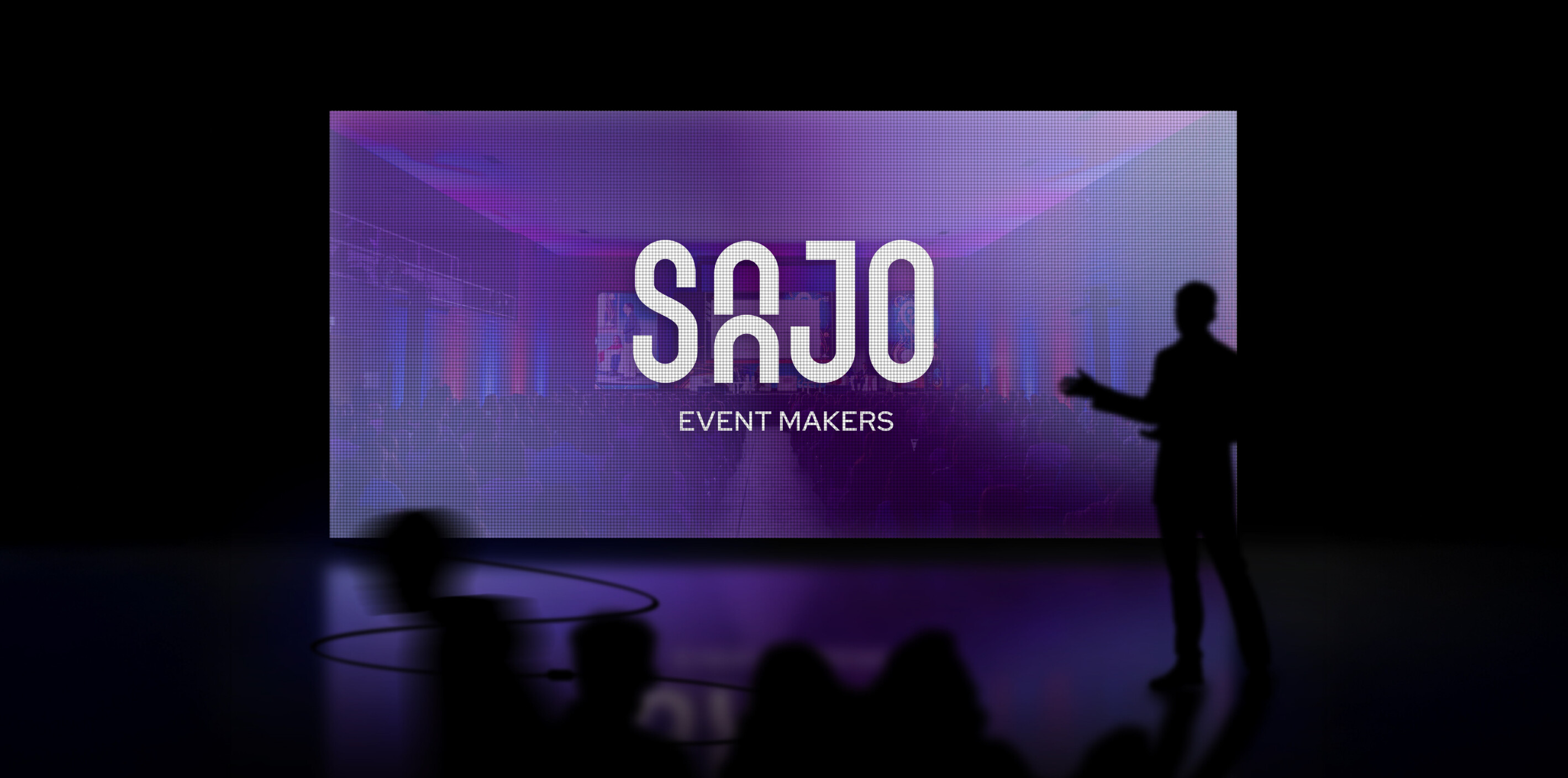
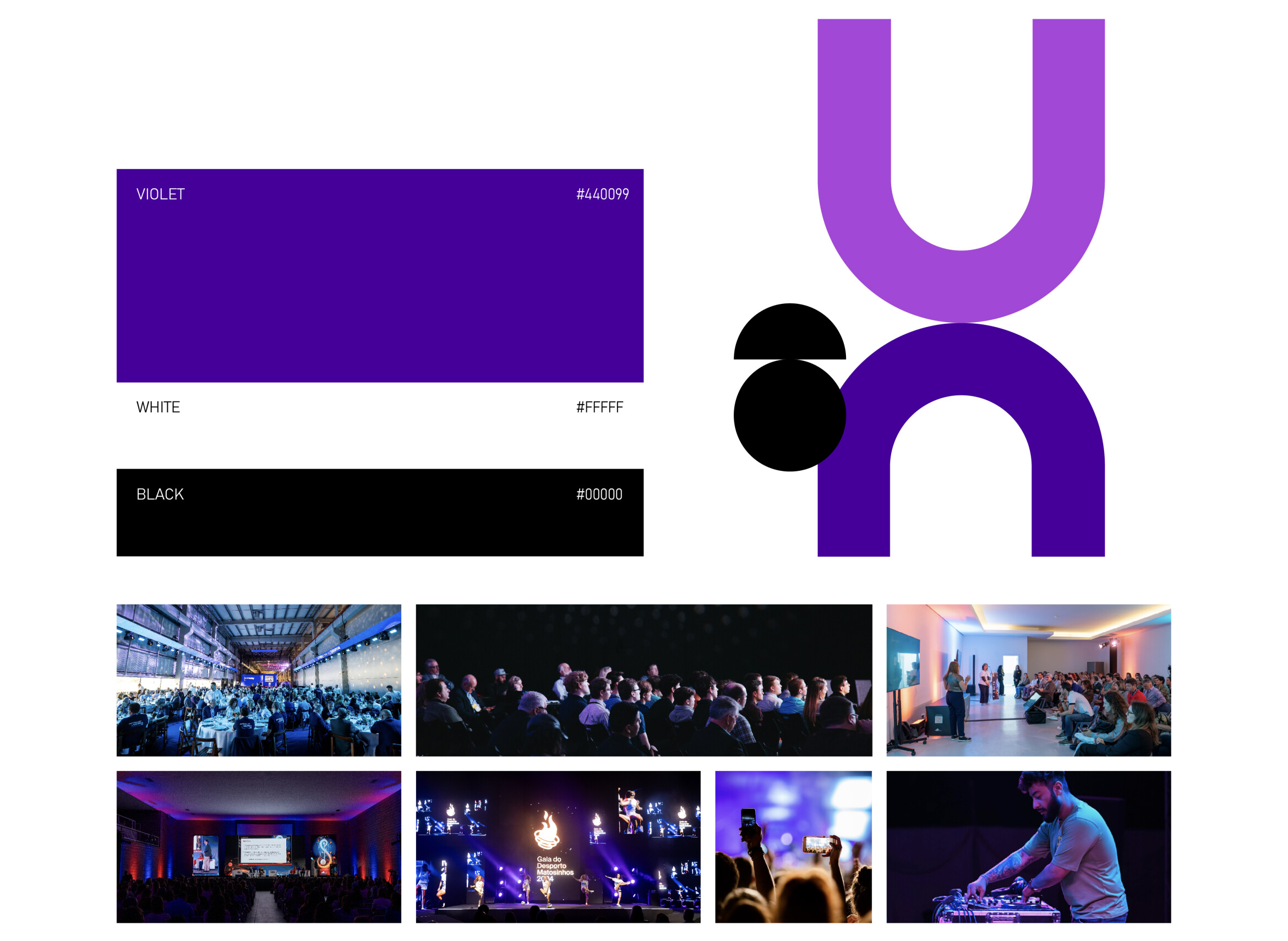
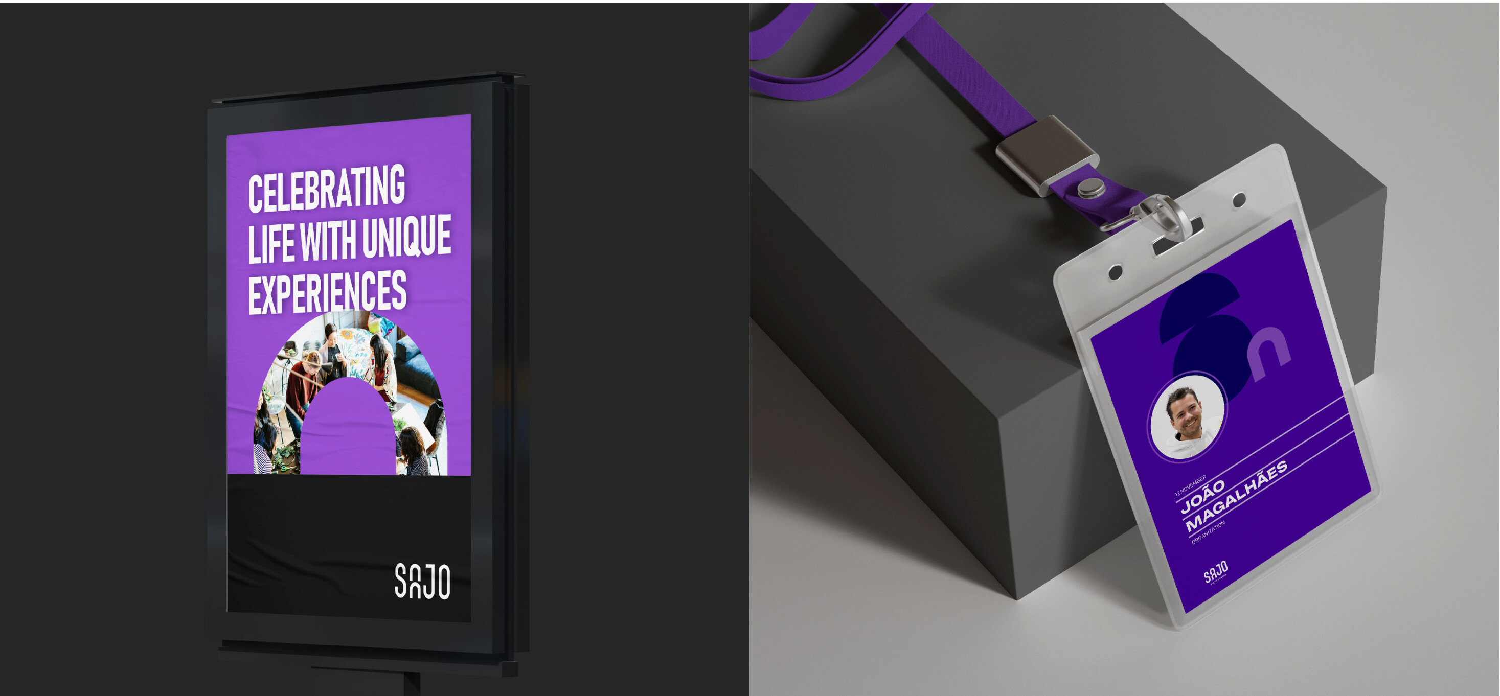
The modern, organic typography celebrates fluidity and contemporary style, while part of the logo, formed by the initials, takes the shape of a magnet, symbolising SAJO’s ability to attract and unite unique individuals around unforgettable events.
The vibrant electric purple embodies the creativity and dynamism that define SAJO’s events, promising unique and immersive experiences. The visual identity invites audiences to experience moments that leave a lasting impression, turning every event into a memorable occasion.


We realize ideas.
Contact us