The label’s role is to make a product stand out while highlighting its finest qualities.
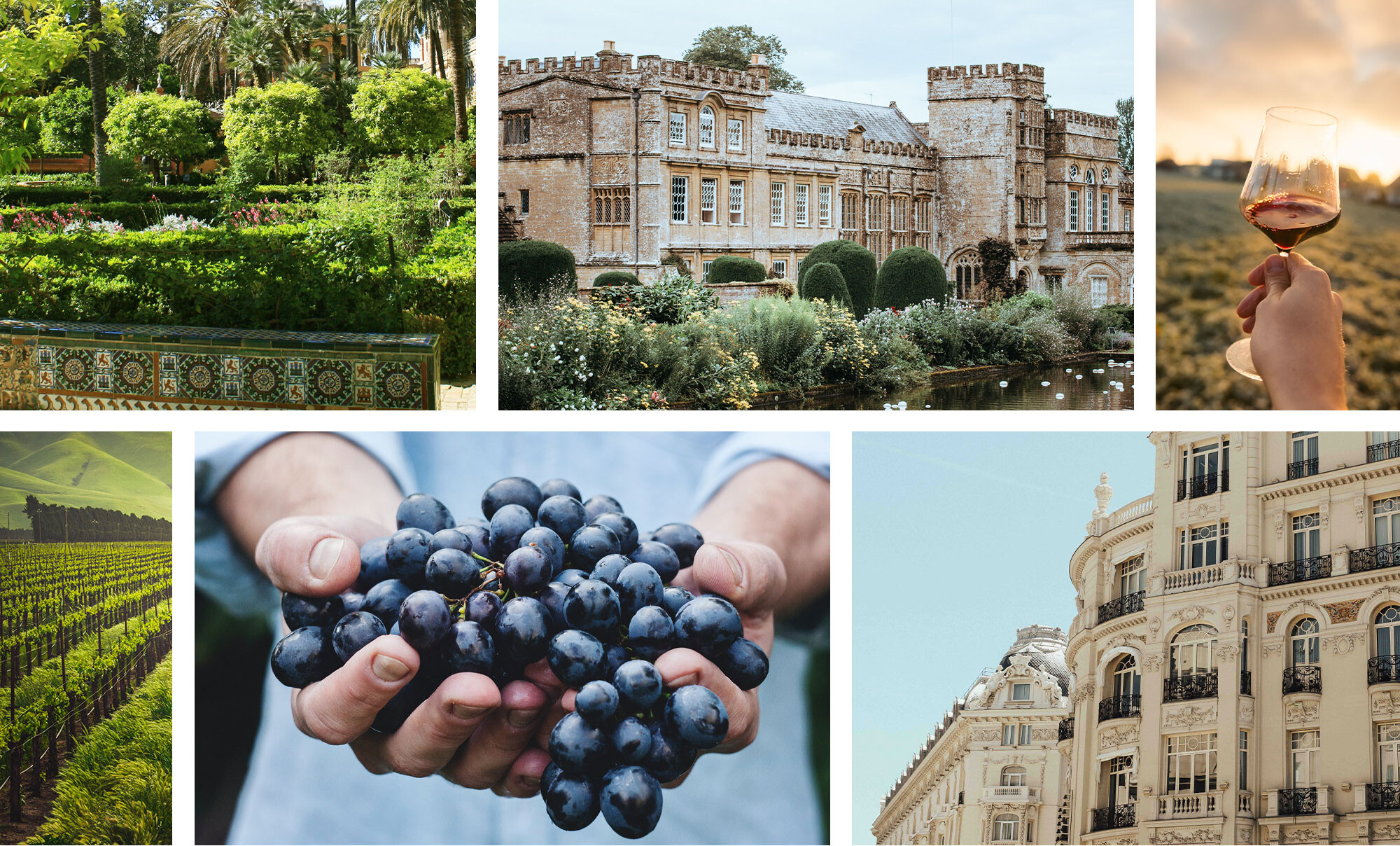
For Varanda dos Reis, a brand synonymous with lightness, vibrancy, and freshness, we created packaging that invites consumers to savour the moment. Vibrant colours and garden-inspired imagery set the tone, while serif typography adds a touch of sophistication and refinement.
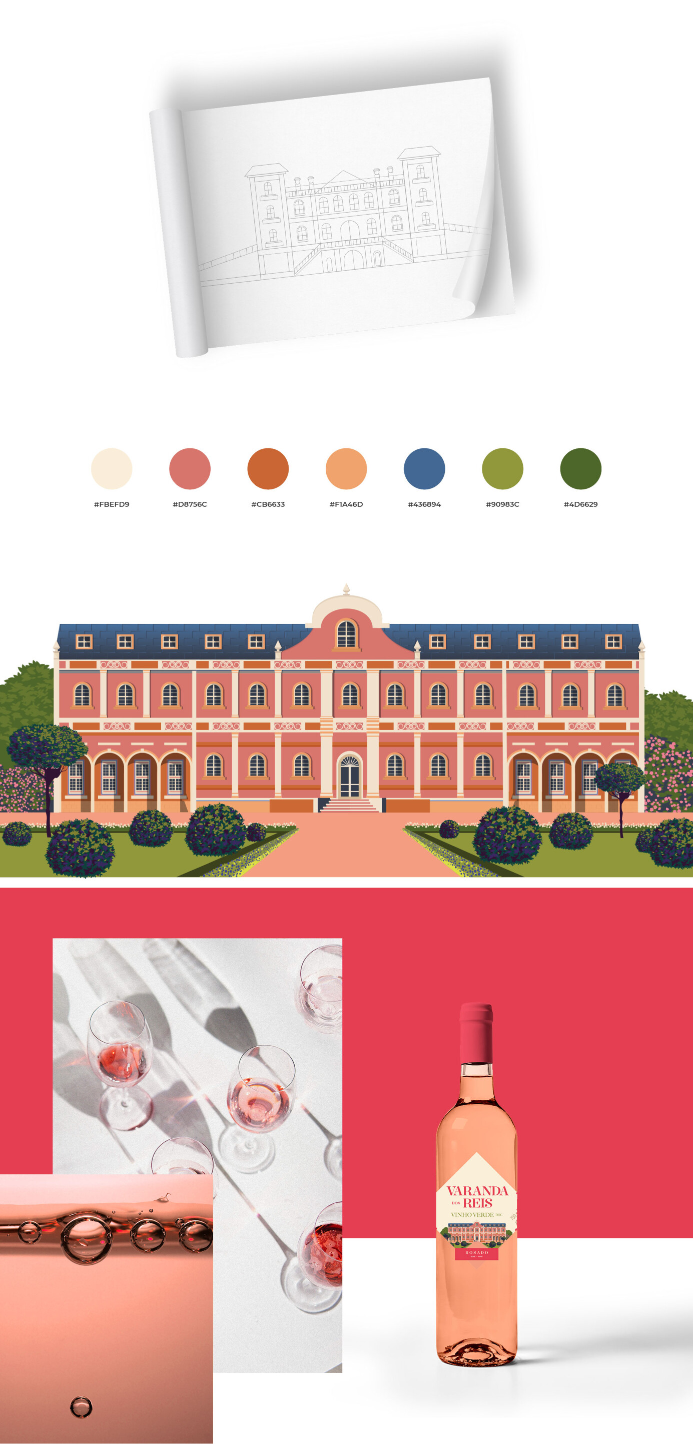
To honour its historical identity, we incorporated noble symbols such as coats of arms, shields, and castles, crafting a brand that is deeply rooted in Portuguese heritage. Designed with the Russian market in mind, where the historical authenticity of a product’s origin is highly valued, the label features a palace inspired by Lusitanian architecture, echoing the grandeur of Portugal’s monuments.
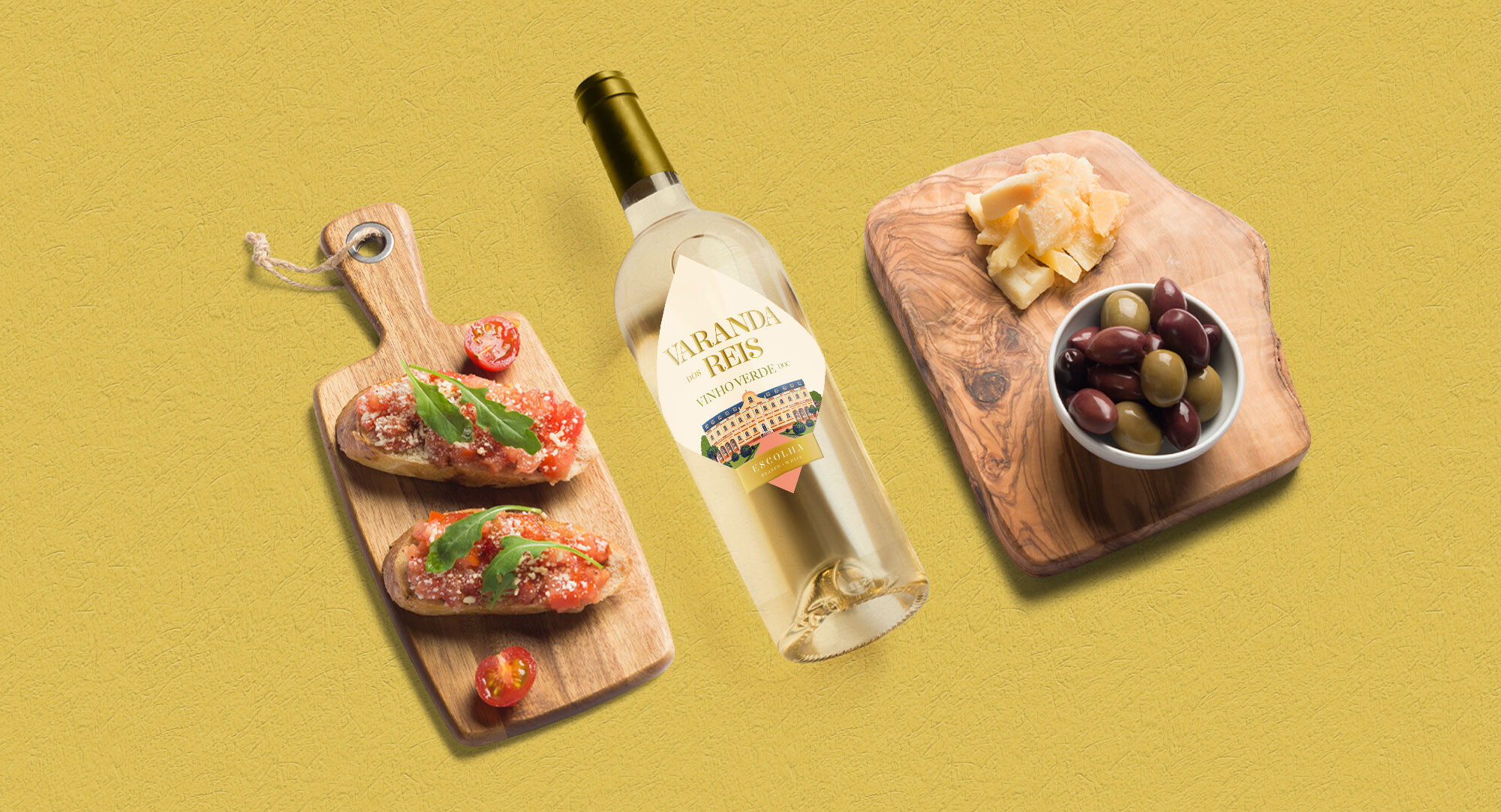
Each wine variety is distinguished by a unique colour palette, ensuring visual harmony and a seamless alignment between the wine’s hue and the packaging details.


