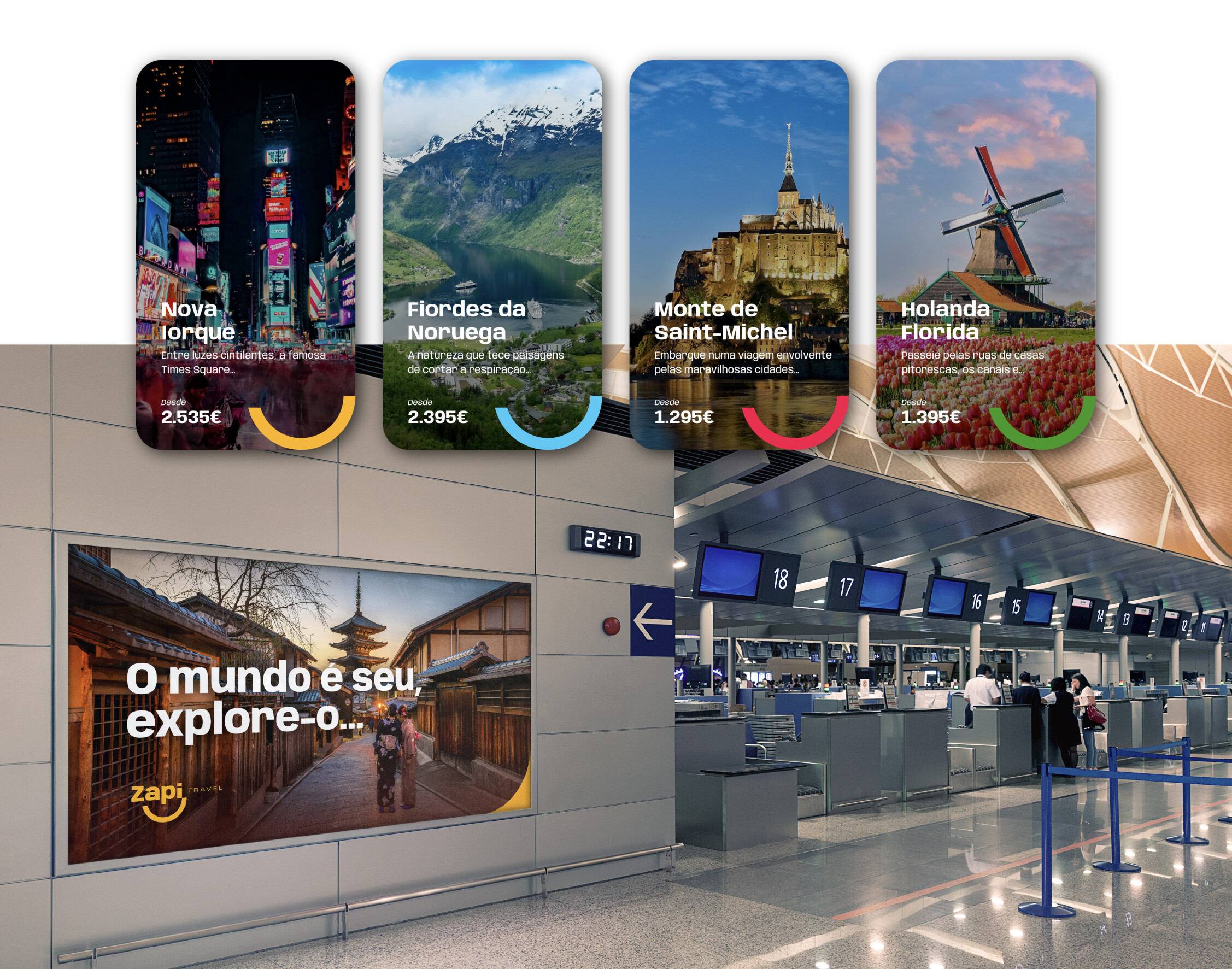
The name Zapi is born from the fusion of two powerful concepts: “zarpar” (portuguese for ‘to set sail’), evoking the excitement of embarking on new adventures, and “happy”, the English word for joy. This combination perfectly encapsulates the mission of this travel agency — to deliver unique, worry-free experiences where happiness and discovery are the ultimate destinations.
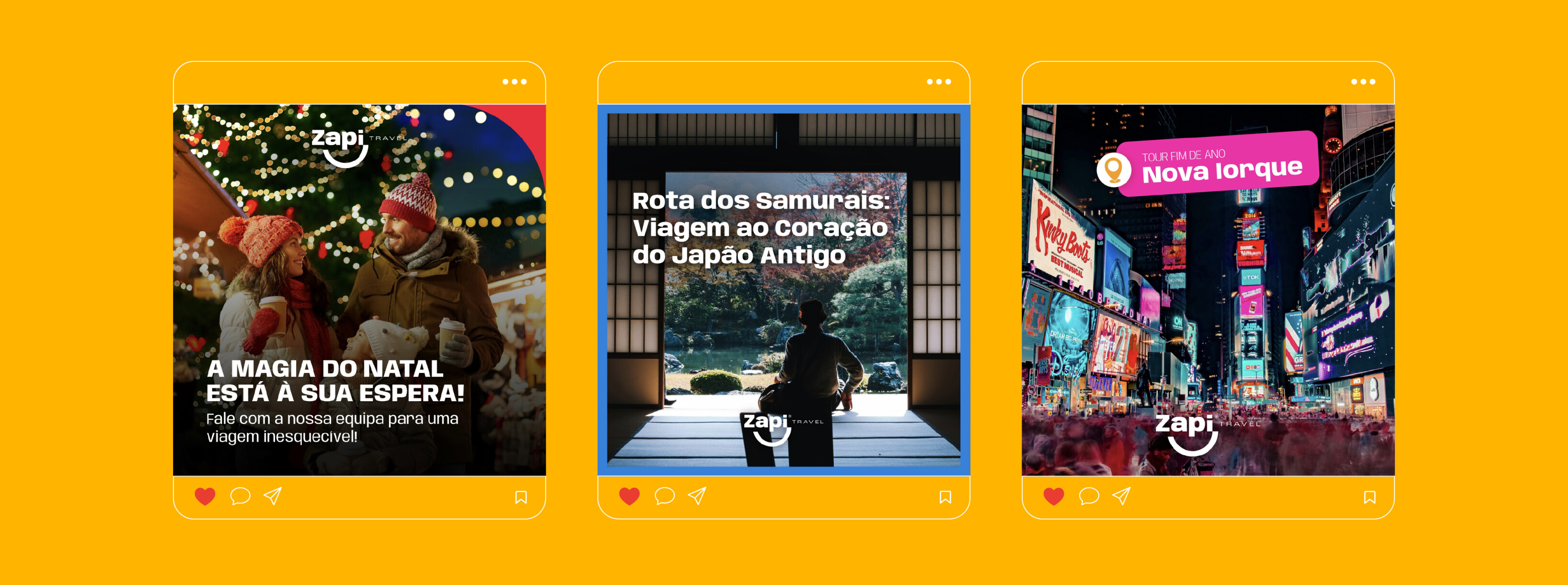
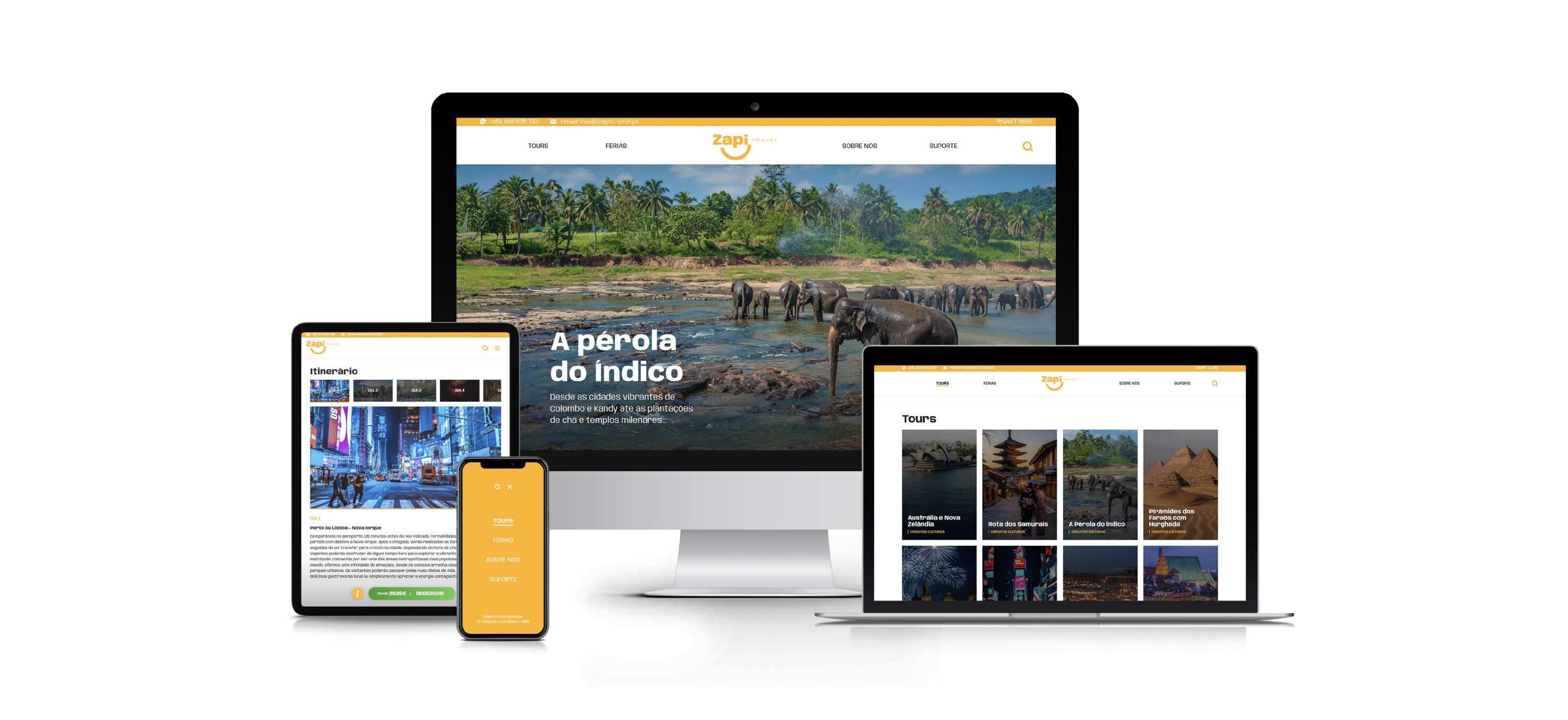
The visual identity is a vibrant celebration of joy, positive energy, and the unforgettable moments that only travel can bring.
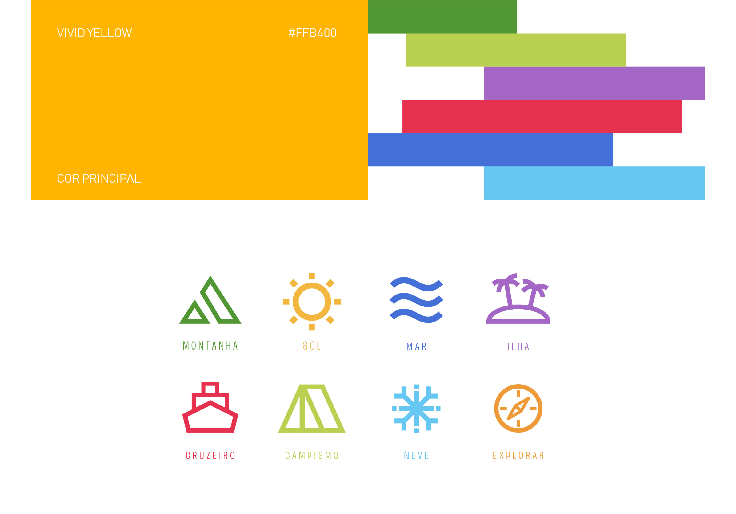
Dominated by a sunny yellow palette, the colours evoke warmth and optimism, mirroring the light and happiness of a perfect trip. The logo, inspired by a smile, embodies the promise of joyful, fulfilling experiences, resulting in a design that is both simple and captivating.
Zapi’s visual identity is more than a brand; it’s an invitation to explore the world with excitement and to embrace happiness in every journey.

